fbpx

Prolyft Digital

Website with Responsive Design

Why Your Business Requires Website with Responsive Design?

Why Your Business Requires Website with Responsive Design?

If you have an online business, you’ve most likely recognized the need to create a website to promote it. But did you know that a responsive website is more than just a pretty face? The truth is, the design of your site can impact your business in ways that you never imagined. It’s essential for your site to be accessible by all types of web browsers and devices so that customers can view it on their phone, tablet, or PC. If they’re scrolling down the page and they see something interesting, they can easily click on it to learn more without having to zoom in or scroll around with their fingertips.

What is Responsive Website Design?
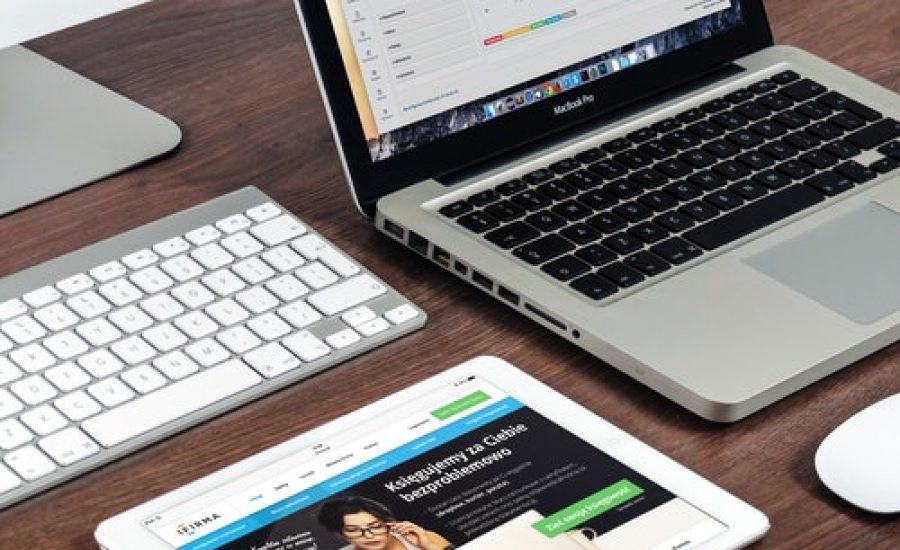
A responsive website design is a way of creating websites that can be viewed on any size and type of device. The website will then automatically change its layout for optimum viewing on the device you are using. Responsive web design is an approach to web design that aims to create web content that provides an optimal viewing experience—easy reading and navigation with a minimum of resizing, panning, and scrolling—across a wide range of devices (from mobile phones to desktop computer monitors). A responsive site adjusts the layout according to the screen size of your device. So, whatever size screen you’re viewing on, it should look great and not require any resizing or panning from left to right.

Stay informed

Benefits of Responsive Design to Your Business

1. Responsive design is important since you care about mobile experience

If you are a business owner, it’s important to know that mobile usage has overtaken desktop usage, meaning that mobile optimization is more important than ever. Mobile users are now the majority of your audience, so since you care about giving them the best experience possible, responsive design is for you. The most common way to present content in a responsive design is to use a liquid layout. Liquid layouts allow for optimal viewing on any screen size and orientation by adjusting the width of containers and spacing accordingly.

2. Having a Mobile-Friendly Websites Enhances Customer Retention Rates by 80%

Having a mobile-friendly website is a critical ingredient for success in today’s digital market. This is because users are increasingly using smartphones to browse the internet. Mobile devices have also replaced desktop computers as the primary means of accessing content on the internet. Mobile devices are getting smarter and faster, with some models now able to access even 5G/LTE networks. The mobile technology industry has also grown exponentially, with cellphone makers like Apple and Samsung investing heavily in their own technologies and innovations to stay competitive. The global smartphone industry will continue to grow at a high rate for many years to come, leading it to be projected that there will be 6.9 billion smartphones in use worldwide by 2023.
image5 2

3. Get ranked on Google with mobile first

Google wants to make sure they are on the right side of history when it comes to mobile search. The new algorithm change is called “Mobile- First Indexing” which means that Google will use the mobile version of a site for its indexing and ranking. But the truth is, many sites are still not responsive or have a poor mobile experience. This means that they might be negatively impacted by this algorithm change. You need to make sure your site/s are ready for this change and all other changes Google might introduce in future.

4. The cost-effective factor

Running two separate websites to cater to mobile and desktop users can be costly. Responsive web design is a wiser option, as it will give you the certainty that your site can be accessed on all devices without paying excessive costs for dual maintenance. Your site will be mobile optimized and accessible to all browsers. To help you save your resources, all designs are loaded on a single website design.

5. You can Easily Create a Responsive Website with WordPress Theme and Hosting Combination

WordPress is a common CMS (content management system) for building websites. The WordPress website hosting can be set up in a number of ways to suit different needs. For example, a blog could be hosted on an inexpensive shared host while an e-commerce site might need a VPS or dedicated server. The best way to create and publish content is through the WordPress platform. It has been shown that the use of CMS platforms like WordPress helps boost traffic by up to 40%. The use of WordPress also saves you time and money in the long run because you don’t have to hire developers or designers who would otherwise charge you hourly rates for their time and effort.

6. Easy to manage

Noticeably, most modern businesses do not have enough time to update their websites with fresh content. Responsive design lets you customize the design and appearance of your website without much of a hassle. So instead of hiring a designer every time you need something changed, you can make the alterations yourself in just a few minutes. Moreover, with one website you can also easily take care of other marketing efforts too! You would never have an issue of not knowing which link to use for your social media update, or of not ensuring that all your links are directed appropriately. This will ensure that all your traffic is directed to the right landing page or site.

Top 5 Websites with Responsive Designs Which are Truly Inspiring

image6 2
image2 2

ETQ

image4 2
image1 2

Woven Magazine

image3 2

How to Make Your Website User-Friendly for All Devices?

Making your website user-friendly for all devices is a long process and it’s not easy. Keep in mind that mobile compatibility is the first step to make your site more user-friendly. When you create content on your site, you should keep in mind that it will be seen on a different screen size so you should make sure that content is readable and accessible to everyone who visits your site. Eight steps to make your website user-friendly on all devices:

  • Listen to your visitors and take feedback
  • Optimize for speed
  • Create in-depth, informative content to ensure user retention
  • Use intuitive navigation across the site
  • Choose your color palette carefully
  • Use intuitive user interface and site layout
  • Use strong CTAs (call-to-action)
  • Build a straight forward contact us page

Conclusion: A Mobile Optimized Website is Critical for Your Company’s Marketing Strategy The best way to grow your business is through online marketing. Your website needs to be mobile optimized, or else you’re missing out on potential customers who are using their smartphones to search for what they need. It is essential to be mobile optimized in order to stay competitive. Mobile optimization allows for easier browsing on a smaller screen, faster loading times, and increased conversions. Hire an in-house team or reach out to professional web design and development companies or agencies to design your dream website for you. Make an impact on your business, thereby bringing a smile to you and your customers alike.

Share on facebook
Facebook
Share on twitter
Twitter
Share on linkedin
LinkedIn

Related posts