Introduction: The Power of Motion UI in Designing and Creating a User Interface
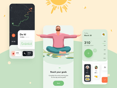
The user interface is a critical part of any application and it reflects the personality of the company behind it. An UI designer should keep in mind that a good UI design has to be intuitive enough to provide an efficient and pleasurable experience for the user. Motion UI is one of the most exciting UI trends in recent years, which has been adopted by apps like Facebook Messenger, Twitter, Slack, etc. This trend helps with everything from delivering messages quickly to empowering designers to create beautiful animations. This section will discuss why Motion UI is important and how it can be used in designing and creating a user interface.
What is Motion UI?
Motion User Interface design is a unique form of UX design that strives to put an emphasis on the interface being alive and well-moving.

Motion UI had not been designed for any specific product, but for any interface – from laptops to tablets to smartphones, and any other form of device with a screen.
The goal is to convey an experience that is more dynamic, lively, tactile and distinctive than static interfaces with menus on screens or buttons on physical products.
Motion UI aims at creating a more immersive experience for users by involving them with what’s happening on the screen. This creates greater enjoyment and satisfaction than just looking at static screens or menus from behind glass screens.
10 Reasons Why it’s the Year of Motion UI
Motion UI emerged as a trend in 2018 with the release of iOS 12. The industry experts, however, predict that it will become a dominant design trend in 2021 and 2022.
- It’s an intuitive way to interact with digital products
- It’s more engaging than static interfaces
- It helps to understand data better
- It is accessible for both sighted and blind people
- It simplifies the user experience and makes it more contextual
- It is surprisingly cost-effective when compared to other design trends of the year, like animation or 3D effects
- The technology is advancing quickly and the tools are becoming more user-friendly each passing day
- The adoption rate of touch screens has increased exponentially
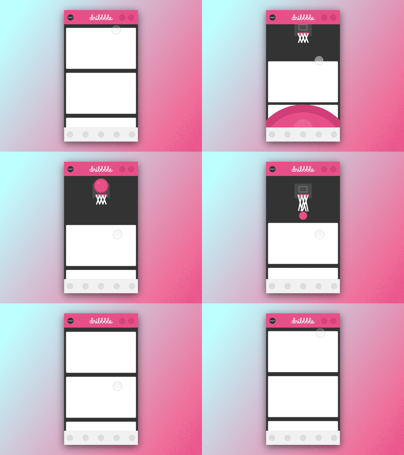
- Animations like slide, scale, spin, and hinge can help you make a more interactive responsive design.
- It captivates users’ attention and increases conversion rates.
Where to use Motion UI?
There are many possibilities in the motion design field that have yet to be discovered. So, it’s up to you how far your imagination takes you and lets you explore ways that motion design can bring transformative experiences to users
Motion UI can be distracting if used excessively in your website. Here are a few parts where we recommend using UI motion:
Welcoming users
Signs of non-personalized messages can make visitors leave. You need personalized and pleasant messages to welcome your visitors, which will make them stay on the website for a while.
It’ll bring a warm welcome to your website visitors and make them feel more welcome. You can also show witty and playful messages to instantly catch their attention.
Confirming activities
When you submit a feedback, transfer money to me or any other transaction, or download the files etc., there are notifications that come to your screen. They can be as simple as “feedback submitted” or “money transferred” and what not!
The user-friendly Motion UI element assists users in the completion of a process. This simple animation aids in the user’s understanding and removes any confusion.
Refreshing content
Social media and news websites offer an up-to-date feed. Small movements can be used on the screen to keep up with what is happening in the world and get updates at any time.

Easing Transitions
You can also use motion design during loading times. Waiting time is usually the most painful and boring, so why not try a fun animation to hold your user’s attention? No matter how slow the device, animations never fail to bring light into any situation.
Motion UI Best Practices For Designing Great Animations
Motion design is all about creating a seamless and aesthetically pleasing user experience. A lot of designers are using animations to create a more personable and immersive experience for the users.
However, not all of them know how to create animations that enhance the design and feel of the app. Below are some useful tips for animation while designing:
- A good starting point for designing great animations is understanding the user’s context and mental state. What do they expect from your motion design? You can figure out this through different research methods like interviews, contextual inquiry, or even observation.
- Motion design should be intuitive throughout the entire UX flow by making sure everything is connected through transitional movements smoothly.
- The motion should complement the content but not overshadow it.
- Avoid animation with too many object movements, colors, and shadows. It will make your design feel cluttered and overwhelming;
- Animations should align on the same plane as the object it is being applied to. With the help of a tool such as Adobe After Effects, you can easily align your animations on any given plane.
Motion UI Examples To Get You Started
The examples below will give you some inspiration and ideas for your own motion design or project!

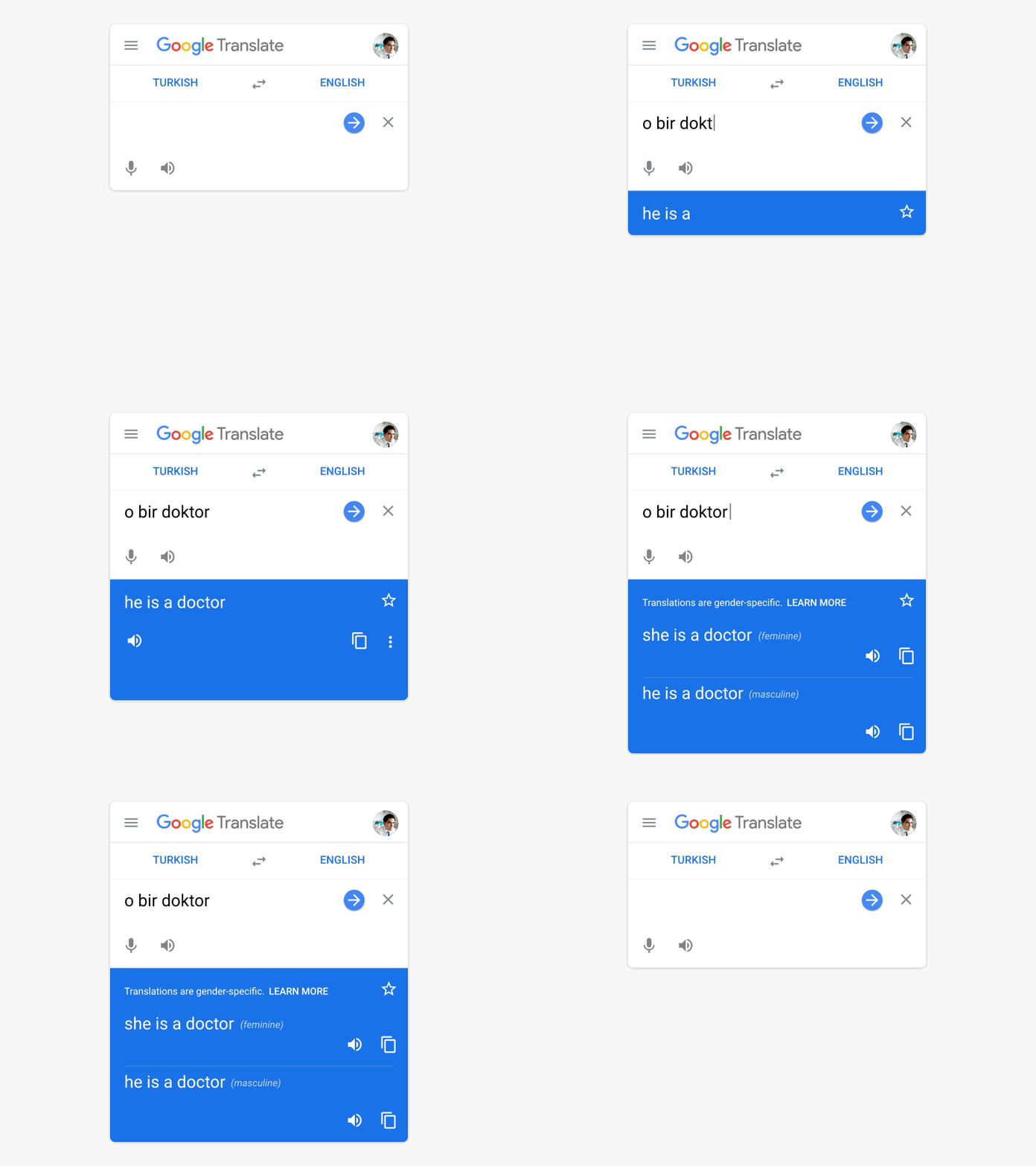
Google Translate has a new website that’s aimed at reducing the bias in translations by showing both masculine and feminine translations for gender-neutral words and phrases.
To showcase these translations, the design team uses simple animations that only focus on one small piece of information at a time.
Once you enter the original phrase, the box will stay compact. As you finish typing it, the box automatically expands to show you the translations.

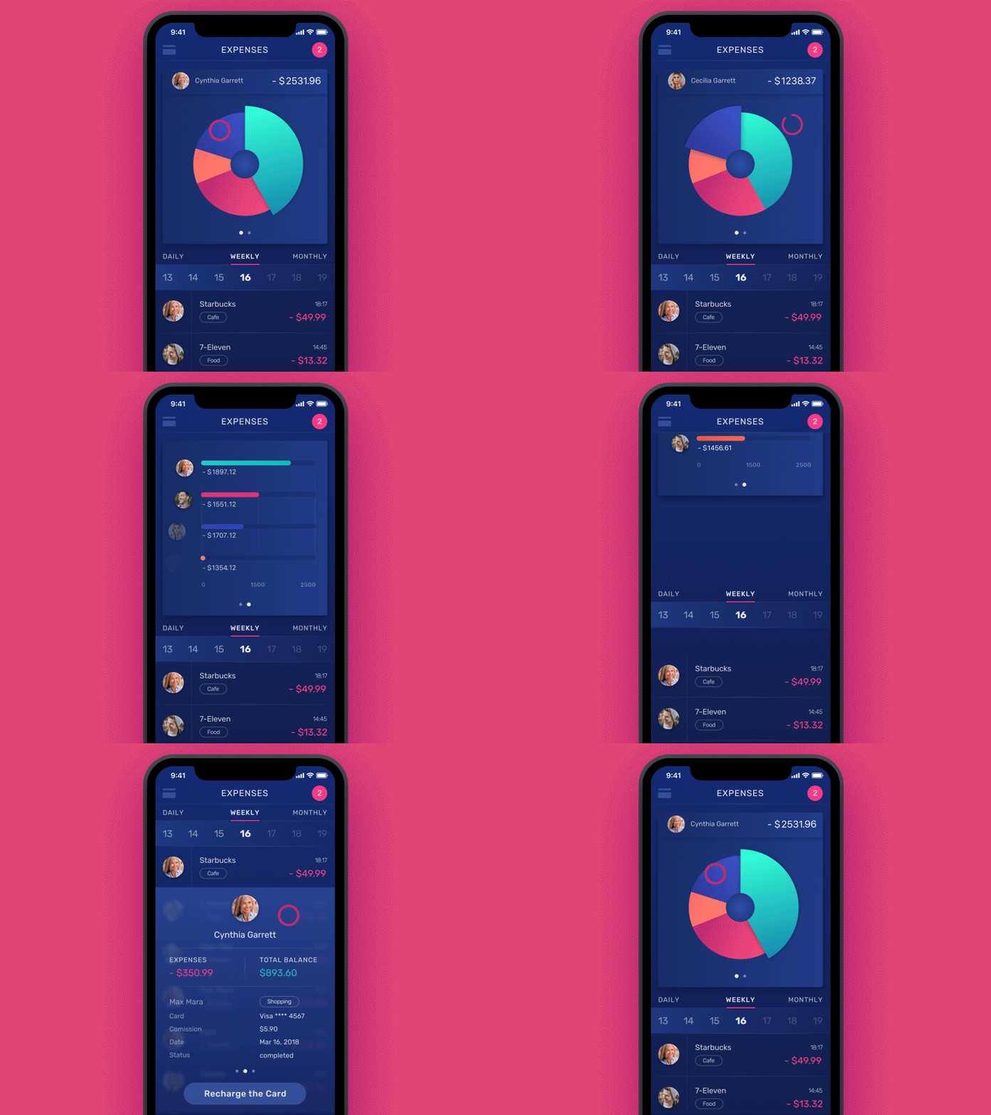
In this budgeting app, motion and color have been used creatively to help people achieve their financial goals.
The pie chart is color-coded and has a new bar graph that details each person. Click on a slice of the pie to see more.
Conclusion: Why it's the Year of Motion UI
In conclusion, now is the time for designers to get ahead of this trend and start designing with motion UI.
Having a good user experience is essential for businesses in today’s data-driven world. Every company needs to provide a great customer experience, which can often be challenging.
Motion UI can help you achieve this goal and make your website feel alive. This will ensure that your customers enjoy the experience on your website and keep coming back.
That means, designing interfaces that are designed to work with touch devices, devices with small screens, or even no screens at all.


